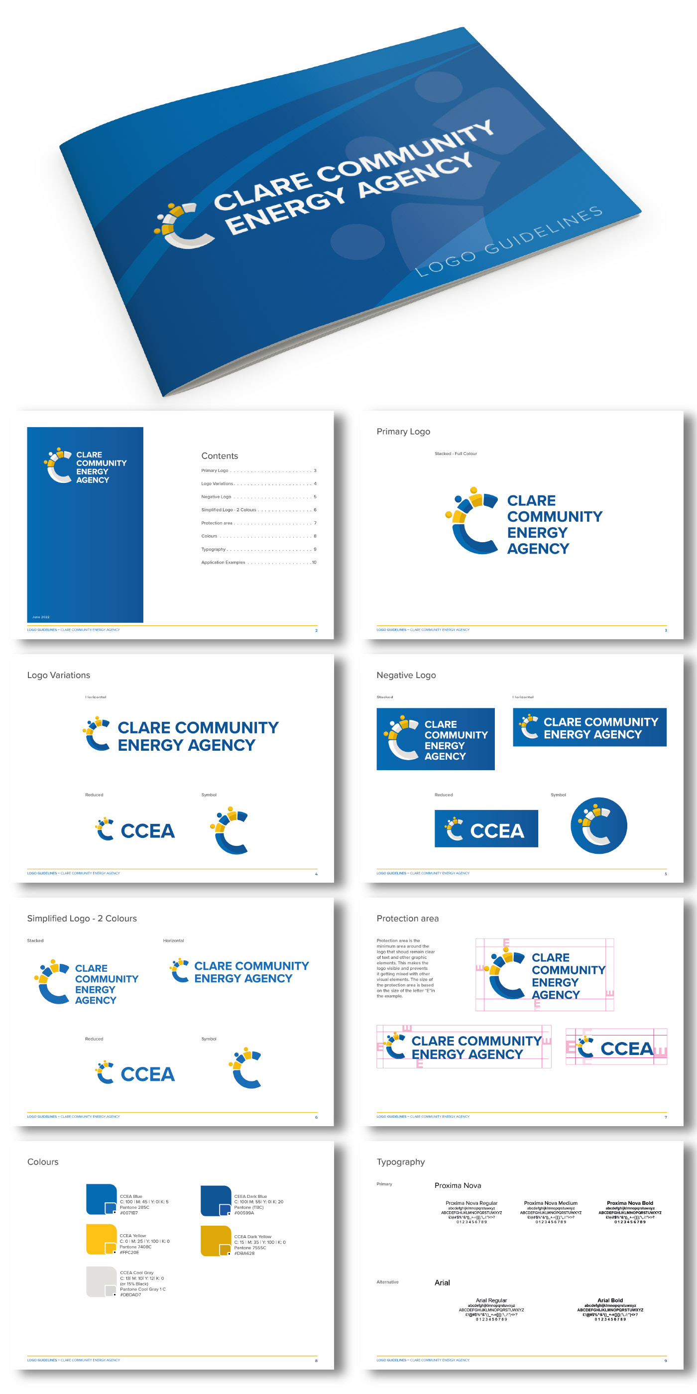
This is a visual identity designed for CCEA (Clare Community Energy Agency).
The goal was to create a symbol that represents the idea of community using the letter "C". Multiple concepts were created for the symbol. In the final design, the letter was split into five parts, with three of them having a circle at the top to resemble the icon of a person.
Regarding the colours, other suggestions were made in the initial concepts, but as the company is based and focused on County Clare, it was decided to adopt the colours of the county crest.
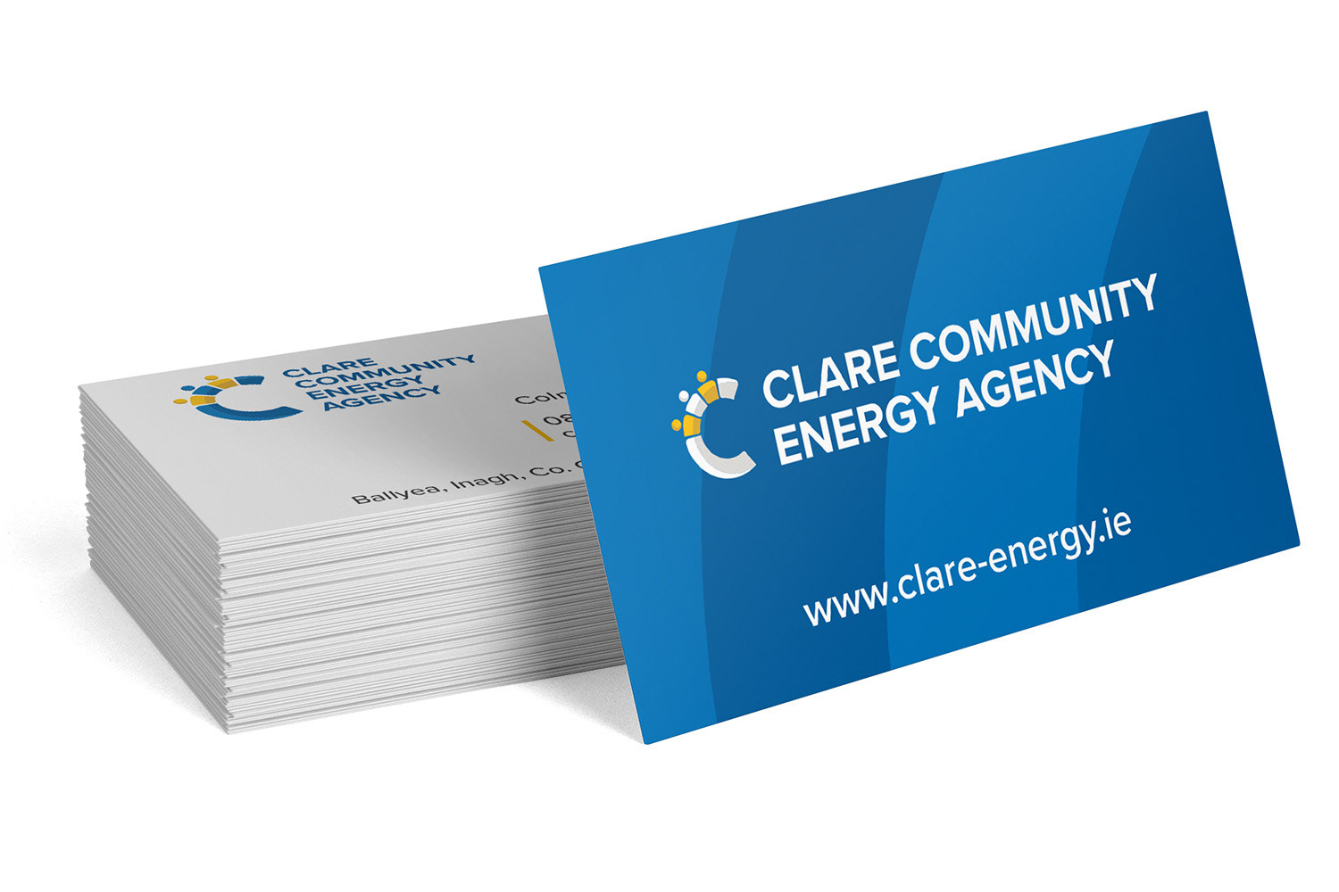
In addition to the visual identity design, the deliverables include a short logo guideline as well as some samples of applications.