Full-Stack Project – HTML5 | CSS3 | Bootstrap 5 | Django | Python | PostgreSQL | Cloudinary
This web application, named "The Fourth Fork," is the fourth Portfolio Project for the Diploma in Full Stack Software Development with eCommerce at Code Institute. The name is derived from its significance as the fourth project and the dual meaning of "Fork," which relates to both web development and cutlery.
The project aims to allow users to create an account, log in, book a table, view, edit and delete existing bookings.
Check the live web site here
Repository available on GitHub.
User Experience
Planning
The planning and development of this project adopt principles of Design Thinking and Agile. Cards containing user stories, and a short description of a feature that would address a user's need, were placed on a board.
Using MoSCoW prioritisation, the stories were categorised as Must Have (critical requirements), Should Have (important but not essential), Could Have (desirable, but they are not required at this stage), and Won't Have (nice-to-have features, but they are put aside in favour of more urgent needs).
User Stories categorised as Won't Have remained in the backlog column for the next interaction.
I've used GitHub for this process. The board is available at this link
The Issues can be seen here https://github.com/zemaciel/pp4/issues
Design
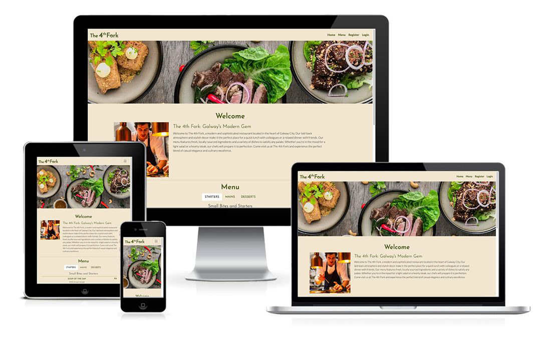
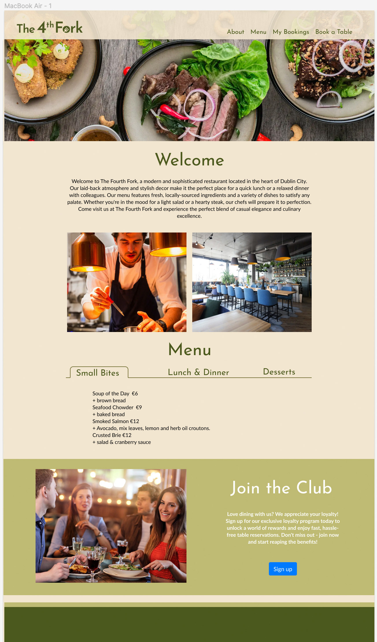
Mockup
In the process of designing this project, I began by creating a mockup. This allowed me to make design decisions such as selecting colours, fonts, and determining the placement of each element with ease. Along the way, some adjustments were made.
Colours
For the website, I choose a colour scheme to represent the restaurant's laid-back, cosy and welcoming atmosphere. A palette of rustic earth tones, such as terracotta, olive green, moss and sand, to evoke a sense of warmth and comfort.
Typography
The font families chosen for this project are Josefin Sans and Lato, both imported from Google Fonts.
Logo and Favicon
I created a straightforward logo for both the navigation bar and the favicon. The design showcases a fork symbol positioned inside the letter "o" in the same colour scheme as the site.