I was hired to create the logo for Loughrea Lodge Guest Accommodation just before its opening in 2018. According to the briefing the accommodation has modern decoration and facilities with new items of furniture.
For the logo design, I choose to use a discreet colour pallet of grey, red and white to express the concept of modern and new. The typeface has a bold weight and a relaxed air to set the idea of comfort and informality.
Using the letter “L”, the first letter from “Loughrea” and “Lodge”, I create the symbol that reminds two checkmarks, showing that everything in the accommodation was checked twice and ready for its guests.


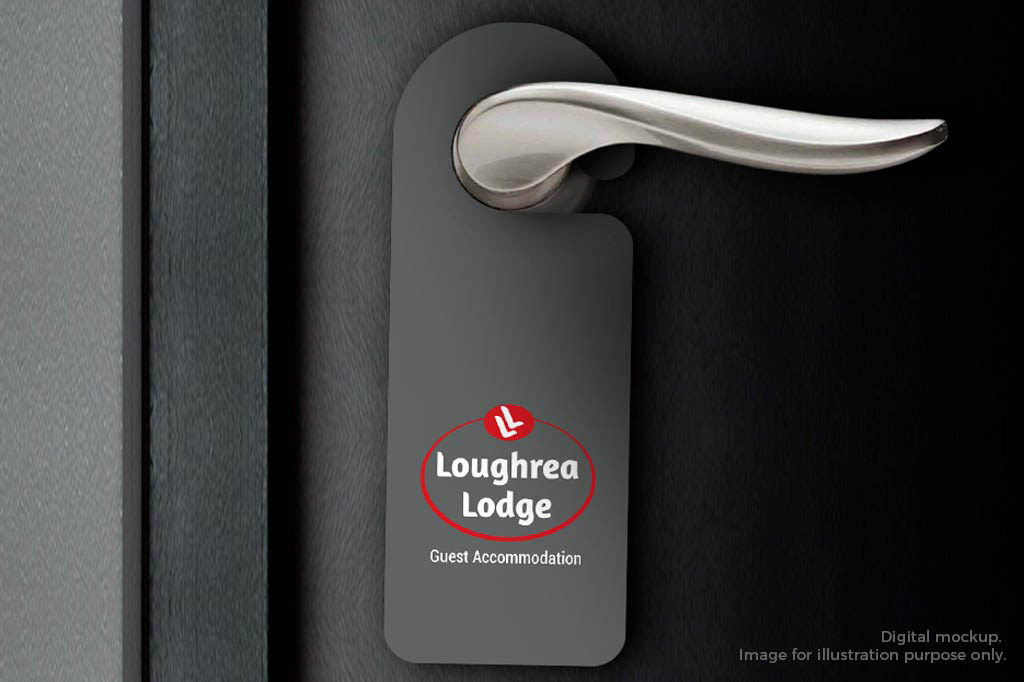
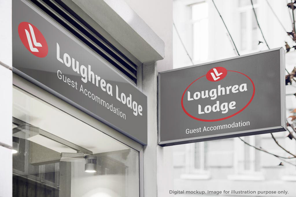
Facade and door tag are digital mockups. Images for illustration purpose only.