Kent Homes Rebrand
Logo Design – Kent Homes, Waterford, Ireland, 2024.

Overview
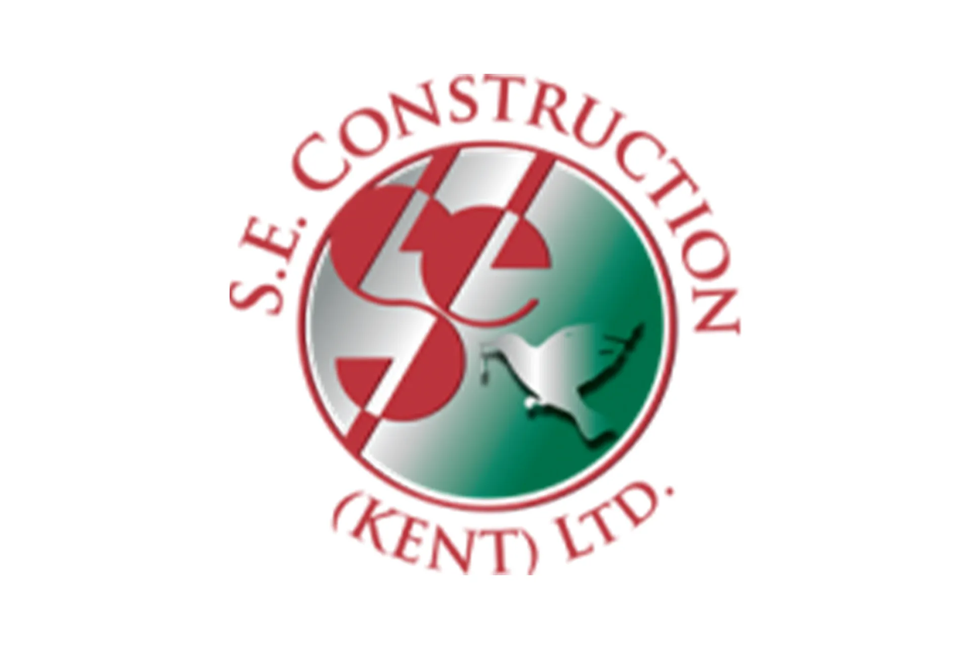
Kent Homes, a well-established construction company in Waterford, Ireland, realised that their existing name and logo no longer reflected the aspirations of their clients. After careful planning, they decided to rebrand from SE Construction (Kent) Ltd to Kent Homes. I was asked to create a new logo and visual identity that felt fresh and trustworthy, while signalling growth and evolution.

The Brief
The goal was to modernise the company’s brand without losing the trust it had built over decades. The new logo needed to feel contemporary and professional, but also grounded and approachable. Most importantly, it had to tell a story.
The Challenge
Not everything needed to change. Early on, I explored several options that combined modernity and strength. One concept—a bold, geometric interpretation of the letter *K*—was especially well received. It was clean and striking, and the client saw potential in it as the cornerstone of the new identity.
But something was missing. After some reflection, the client shared that they wanted to retain the **bird symbol** from their previous logo. It hadn’t come up during the briefing phase, but it became clear that the bird had personal and symbolic meaning. In their existing design, a bird carried a branch—a nod to the idea of building a nest, building a home. The old logo wasn’t refined, but it carried a story. And that story still mattered.
.A Personal Realisation
Birds are remarkable builders. Growing up in Brazil, I was fascinated by the João-de-Barro (Furnarius rufus ), a bird known for constructing clay-oven-like nests on top of power poles. That image stuck with me. Here in Ireland, I often watch swifts and crows building sturdy nests in the most unlikely places—testament to their skill and resilience. In hindsight, it’s surprising I didn’t notice the symbolism of the bird right away. But once the client mentioned it, everything clicked. The design needed to evolve, not erase.
The Solution
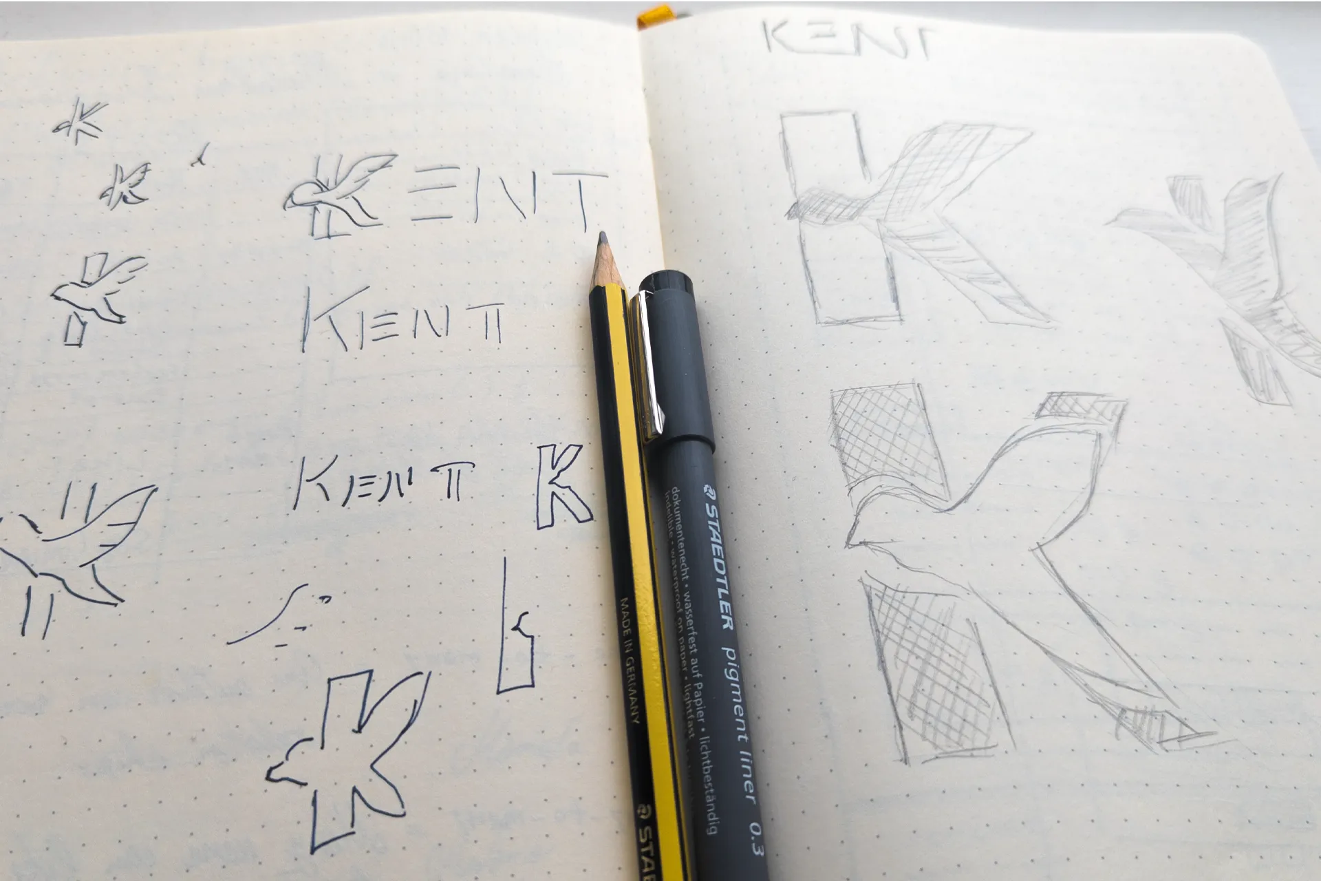
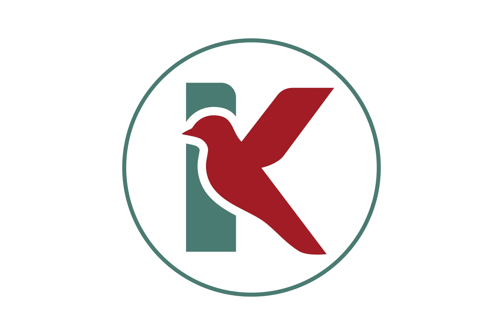
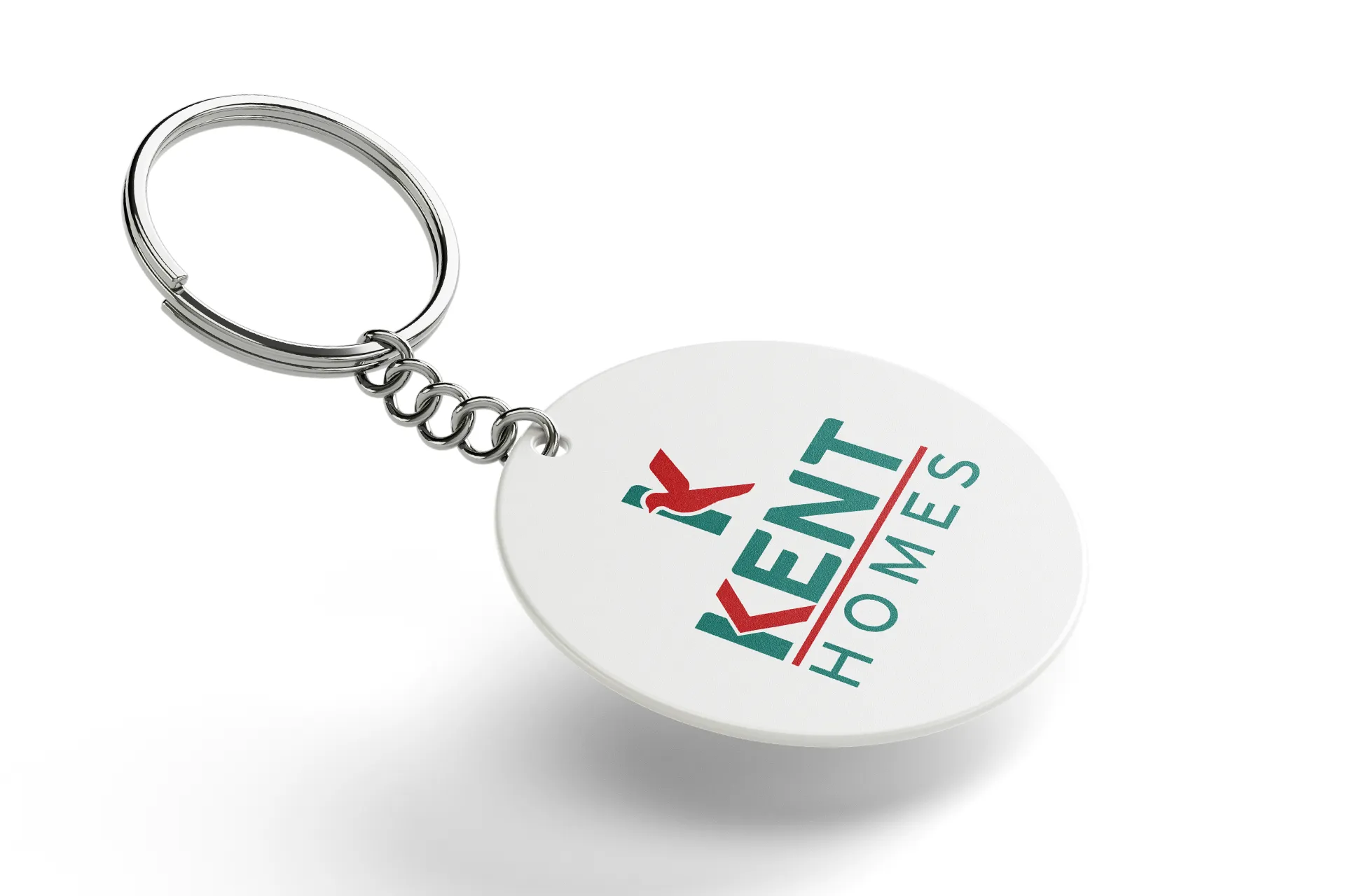
The challenge became an opportunity. I returned to the earlier K concept and reimagined it to include the bird. The breakthrough came in the form of a simple visual illusion: a bird flying through a negative space that forms the letter K within the word KENT. This solution combined the geometric clarity the client appreciated with the emotional depth of the bird symbol. It became a logo that told a story—one of progress, care, and continuity.
Design Details
The final logo strikes a balance between strength and subtlety. Bold lines communicate trust and reliability, while slightly softened corners add a sense of warmth. The clean, modern typography ensures excellent readability across all formats. One of the logo’s key strengths is its adaptability. Whether displayed on a mobile screen or a construction site hoarding, it holds its form and remains instantly recognisable. The bird, while subtle, becomes a small discovery—adding depth and character without being overbearing.
Final Outcome
The final deliverables included:
- A comprehensive logo guidelines document
- A full set of logo files for print and digital use
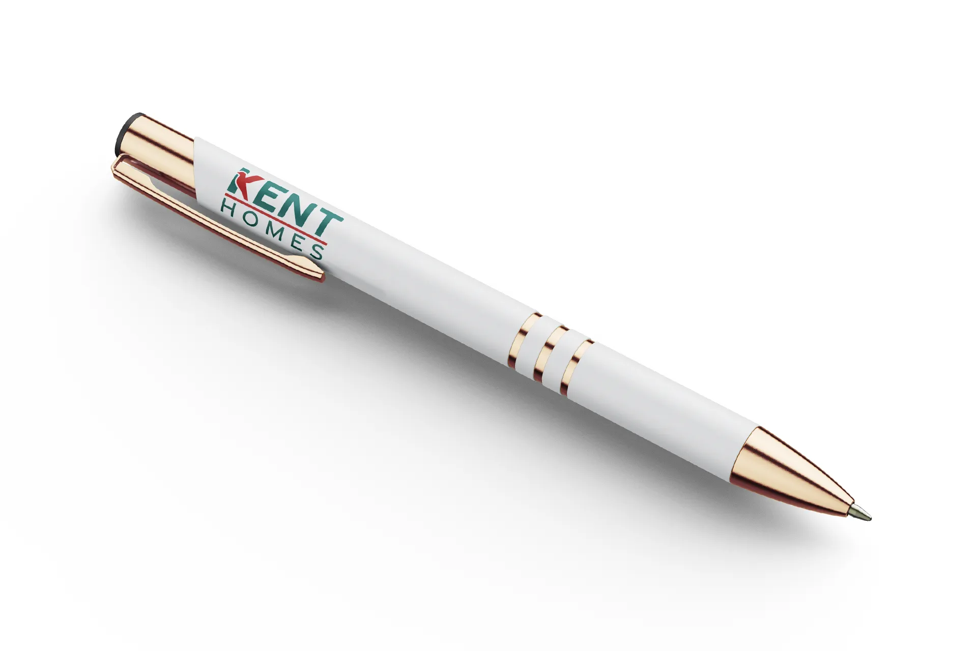
- Real-world mockups to show the brand in action
But more importantly, we created an identity that honours the company’s roots while looking confidently to the future. The new Kent Homes logo is more than just a mark—it’s a bridge between tradition and progress. This project reminded me of the importance of listening—not just at the start, but throughout the design process. Sometimes, the most meaningful ideas emerge from unexpected moments. The bird, in this case, wasn’t just a detail. It became the heart of the design.
Project Gallery

Project Details
- Client: Example Brand
- Tools: Illustrator, InDesign, Photoshop
- Year: 2024
- Role: Concept, Design, Art Direction